
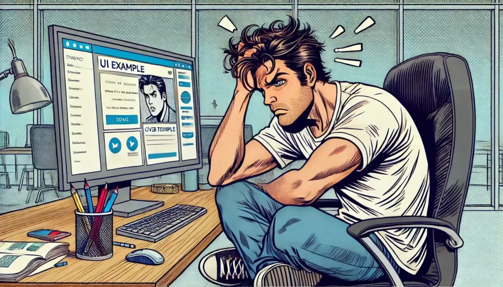
We’ve all been there – meticulously designing the perfect user interface, aligning elements with pixel-perfect precision, picking just the right colors to evoke emotion, and creating a flow that even a robot could understand. And then comes the real test: the users. Oh boy, do they have other plans. They’ll click where they aren’t supposed to, scroll right past crucial information, and basically act like they’ve never used a digital device before. Sound familiar?
Here’s the deal: designing for humans is like herding cats. Unlike robots, humans come with all their quirks, habits, and irrational behaviors. The best part? We can’t change them. But what we can do is design with their unpredictable, very human nature in mind. So, let’s break down the hilarious (and sometimes maddening) world of designing for real people – because they aren’t robots, even when they act like it.
Humans Don’t Read (They Skim)
Let’s start with a truth bomb: users don’t read. They skim. They’re on a mission to find what they’re looking for as fast as possible, which means they’ll ignore most of that carefully crafted copy you spent hours perfecting. Yep, sorry.
This is the classic “TL;DR” syndrome. Users just want the highlights – the juicy bits – without the fluff. And when they don’t find it right away? They’ll bail faster than you can say “conversion rate.” This is why designing for skimmers is crucial. Think bite-sized content, clear headings, bullet points, and visuals that do the talking.
But here’s the kicker: when users do decide to read something in-depth, it’s usually at the most unexpected time. They might get obsessed with that tiny disclaimer text you placed at the bottom or spend five minutes scrutinizing the FAQ section. Go figure. The lesson here? Make your key information scream “READ ME” but don’t underestimate the power of well-placed microcopy for those moments when users do decide to go full detective.
The Illogical Logic of User Actions
The truth is, users’ actions are often driven by habit, not logic
Let’s talk about user behavior that seems to defy all logic. You design a form with clear instructions, and what do users do? They leave half of it blank, write in all caps, or input their email address in the “name” field. You put a bright, flashing CTA button right in the center, but they ignore it and click on some tiny, irrelevant link in the footer. Why? Because humans, that’s why.
Here’s a classic: the “Back” button. Users have a habit of clicking “Back” when they’re lost. It’s like their digital comfort blanket. You can place the clearest breadcrumbs or navigation menu right there, but when in doubt, they’ll still retreat to the safety of “Back.” And let’s not forget the instinctive “double-click on everything” behavior, as if they’re stuck in the early 2000s trying to open a file on a desktop.
The truth is, users’ actions are often driven by habit, not logic. So, what’s a designer to do? Embrace it! When designing, you have to consider these quirky human tendencies and build around them. Don’t fight the irrationality; design to guide it.
The Art of Designing for the Unexpected
Now, this is where the real design magic happens. Crafting an interface that caters to human unpredictability is an art. You’re not just designing for the perfect scenario – you’re designing for the worst-case, most off-the-wall, “did-they-really-just-do-that?” scenarios.
Take form inputs, for example. You’d think filling out a name or phone number is straightforward, but nope! Users will throw in all sorts of surprises – from emojis in the name field to country codes you didn’t know existed. The key? Flexibility. Make sure your design can handle a wide range of inputs, and guide users when they inevitably go off-script.
Five Design Tips for Real Humans (Not Robots)
Let’s break down some practical ways to design for human behavior. These are my top tips for keeping things user-friendly, even when users are anything but logical.
Prioritize Visual Hierarchy
Humans skim before they read. Use headings, subheadings, and bullet points to create a visual flow that guides users to key information. If it’s important, make it stand out!
Design for Mistakes
Expect users to mess up, click the wrong button, or enter gibberish in forms. Add helpful error messages, include a “clear” option, and use auto-suggestions to steer them in the right direction.
Make Interactions Forgiving
Think “undo” options and confirmation prompts for major actions. People change their minds, and they panic-click. Let them backtrack without penalty.
Keep it Consistent
Consistency is key in building user trust. Use the same design patterns for navigation, buttons, and interactions. When users know what to expect, they’re less likely to get lost or frustrated.
Test with Real Users
I know, it’s tempting to trust your design instincts, but user testing is a game-changer. Observe how actual humans interact with your design. You’ll catch quirks and hiccups you’d never expect.
Users Love Control (Or the Illusion of It)
The progress bar element, It’s not just about showing how much longer a task will take, it’s about providing a sense of control
Another thing about humans: they like to feel in control. Even when they have no clue what they’re doing, they want to believe they do. This is why adding options like “Cancel,” “Undo,” and “Back to Home” can make users feel safe as they navigate through your product.
Take the humble progress bar, for example. It’s not just about showing how much longer a task will take, it’s about providing a sense of control. Users see progress, they relax, they keep going. On the flip side, if they’re left guessing how long an action will take or if it’s even working at all, they’ll get anxious and start mashing buttons or – horror of horrors – abandon the process altogether.
This is why it’s essential to sprinkle in those comforting UX touches. Loading spinners, confirmation messages, and clear labels aren’t just functional; they’re psychological cues that tell users, “Hey, we got you.”
The Love-Hate Relationship with Choices
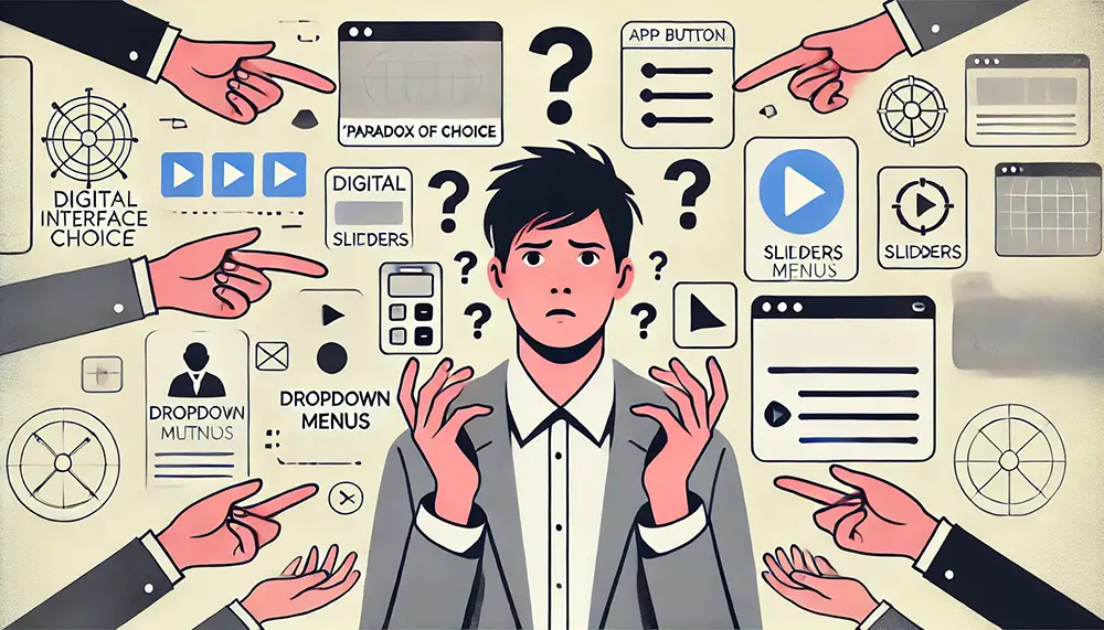
Ah, choices. Give users too few, and they’ll feel boxed in. Give them too many, and they’ll get overwhelmed and bail. This is what we call the “paradox of choice.” Humans want options, but they also want simplicity. And finding that sweet spot is key.
The trick is to limit the number of options on any given screen. Less is more. And when choices are necessary, present them in a way that guides the user to the most beneficial or popular option. For instance, highlight a recommended plan in a pricing table or use subtle cues like color to nudge users toward a specific action.
Here’s a tip: if a particular choice seems too technical or complex, break it down into smaller, digestible steps. Use progressive disclosure to hide complexity until it’s needed. This way, users don’t feel bombarded with choices all at once, but they still have the control they crave.
Designing for the Perfectly Imperfect
Designing for humans means embracing their quirks, unpredictability, and occasional irrationality. It’s about creating interfaces that not only guide users but also anticipate their offbeat behaviors. Remember, users aren’t robots, and that’s what makes this whole design thing both challenging and incredibly fun.
At the end of the day, it’s all about designing products that feel natural, intuitive, and forgiving. We’re not here to change how humans think or act; we’re here to create experiences that meet them where they are – in all their wonderfully chaotic, imperfect glory. So, let’s stop designing like our users are robots and start designing for the humans they are.


