The Secret Life of a Button: A Day in the Life of a Product Designer
From mobile nightmares to corner shape debates, this is my take on the not-so-simple life of designing the perfect CTA button.

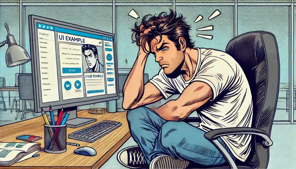
Designing a button might sound easy, right? Just slap a rectangle on the screen, add some text, and boom – you’re done. But oh boy, if only it were that simple. There’s a whole world behind that tiny element that most people wouldn’t even think about. And as a product designer, I’m here to tell you: buttons have feelings too! Alright, maybe not feelings, but they definitely have a lot going on behind the scenes. Let’s dive into the “secret life” of a button and what it really takes to design that perfect click-worthy experience.
Button Beginnings: It’s More Than Just “Make It Pop”
Let’s clear this up first – there’s no magical “make it pop” button in my design toolbox. Designing a button starts with one key question: What do I want the user to do? This is where things get interesting. The button’s whole purpose is to guide users toward an action, whether it’s “Sign Up,” “Submit,” or “Buy Now.” And that means it needs to look inviting and intuitive, but not scream for attention like a neon sign.
The journey of a button begins with some brainstorming. Do I want it to blend in and be subtle, or should it be a focal point that commands the user’s attention? Should it be a primary action button or a secondary one? These questions might seem trivial, but they shape the entire user experience.
Color is the next big thing. I mean, it’s common sense – you’re not going to design a “Cancel” button in bright red unless you want users to feel like they’re about to launch a missile. Color psychology plays a huge role here. Blue for trust, green for positive action, red for warning. It’s like picking the right outfit for an event; your button has to dress for the occasion.
The Real Struggle: Size, Shape, and Spacing
Here’s where the real fun (or struggle) begins. A button’s size isn’t just about making sure it’s big enough to press. It’s about finger comfort. Have you ever tried to tap a tiny button on your phone screen and ended up hitting everything but the button? Yeah, that’s a design fail.
As a designer, I need to keep different devices in mind. A button that’s perfect on a desktop might be a nightmare on mobile. So, I’m constantly thinking about how the button will scale across various screen sizes. And the shape? Let’s talk about corners. Rounded corners vs. sharp edges is an age-old debate in design. Rounded corners often feel more friendly and approachable, while sharp edges are modern and sleek. But there’s no one-size-fits-all answer – it depends on the overall vibe of the product I’m designing.
Then, there’s spacing. A button needs breathing room. It can’t be crammed into a corner or surrounded by other elements that distract from its purpose. Padding around the button is key. The goal? Make it look clickable and approachable without screaming, “Click me! Click me!”
Microcopy Magic: Words Matter, Big Time
Now, let’s talk text – the words that go on the button. This part is crucial. The text needs to be concise, action-oriented, and friendly. Users should know exactly what’s going to happen when they click that button. It’s not “Click here,” it’s “Get Started.” It’s not “Submit,” it’s “Join the Club.”
Crafting that perfect button microcopy is half the battle. It’s like writing a catchy headline that grabs attention but also sets the right expectations. If I make it too generic, users might hesitate, unsure of what will happen next. Too quirky, and it might confuse them. The right words – that’s where the magic happens. A simple “Learn More” can open the door to endless user interaction.
5 Key Rules for Button Awesomeness (Because We All Love Lists)
Alright, let’s break down the essentials of button design into a neat list, because who doesn’t love a good checklist? Here’s my rulebook for crafting a killer button:
- Make It Obvious: Your button should look like a button. Users shouldn’t have to wonder if it’s clickable. Keep the shadows, gradients, or borders to make it stand out as an interactive element.
- Keep It Consistent: Use the same style for buttons throughout the product. Primary actions? One color. Secondary actions? A different, more subtle color. Consistency builds user trust.
- Prioritize Action-Oriented Text: Use verbs that guide the user. Think “Start Now” instead of “Click Here.” It’s about telling the user what they’re doing, not how to do it.
- Size It Right: Not too big, not too small – make it thumb-friendly for mobile and clear enough on larger screens. Aim for at least 44×44 pixels for mobile tap targets.
- Spacing Matters: Give your button some room to breathe. Padding around the button helps draw attention to it without making it look desperate for clicks.
Accessibility: Designing for Everyone (Not Just People with Perfect Eyesight)
The secret sauce in button design? Accessibility. That’s right – designing for everyone means taking into account users who might not see or interact with buttons the way we expect. High contrast is key here. If your button text is light gray on a slightly darker gray background, congratulations – you’ve just created an accessibility nightmare.
I also make sure buttons are easy to navigate using a keyboard. Not everyone uses a mouse or touchscreen. Adding a focus state – that little outline that appears when you tab through elements – is a small tweak that makes a huge difference.
And let’s not forget screen readers. A button labeled as “Submit” should have an accessible label explaining its purpose in more detail, like “Submit your registration form.” It’s these little details that create a seamless experience for all users.
Button Testing: The Final (and Never-Ending) Chapter
Once the button is designed, it’s time for the ultimate test – the user test. This is where I put my masterpiece into the hands of real users and watch what happens. Do they know where to click? Are they hesitant? Is the color throwing them off? Testing reveals all the truths that my designer brain might have overlooked.
And guess what? It’s an ongoing process. User feedback helps fine-tune the design. Sometimes, I’ll tweak the text, adjust the padding, or change the color slightly based on how users interact with the button. It’s like tweaking a recipe until you get the perfect flavor.
Wrapping It Up: Buttons Are People Too (Kind Of)
So, there you have it – a glimpse into the secret life of a button. It might be small, but it’s mighty. It carries the weight of user interaction on its tiny digital shoulders. Designing buttons isn’t just about making them “pop”; it’s about crafting a delightful, intuitive experience that guides users through your product with ease.
Next time you click a button, remember – there’s a lot more going on behind the scenes than meets the eye. And hey, if you’re a fellow designer, keep rocking those button designs. Because at the end of the day, a well-designed button can be the difference between a user saying “meh” and clicking “YES!”


