Redesign an ITSM Platform

SysAid, a leading IT Service Management (ITSM) platform, embarked on a major redesign in 2022 with the development of Spaces, a new system aimed at replacing the legacy Classic platform, which had been in use since 2002.

The objective was to create a modern, user-centric interface that simplifies complex workflows and improves the overall user experience for IT professionals managing service requests, asset management, and incident resolution.

Spaces was first introduced to customers in November 2023, marking a significant leap forward in addressing the usability challenges of the older Classic system.

Years

2022-2024

Role

UX Lead,
Product designer

SysAid – Before & After

Queue

Ticket Page

Design Process

My Role – Product Design Lead

I led the redesign of Sysaid’s platform and managed a team of two product designers, overseeing the entire design process from ideation to execution. I ensured the team maintained a user-centered approach while aligning with business goals, guiding them through each phase of the project.

I worked closely with the lead product manager and her team to gather product requirements, align on acceptance criteria, and participate in discovery sessions. In parallel, I collaborated with the R&D team, delivering designs, participating in technical discovery, and supporting Q&A during development.

Additionally, I maintained an open feedback loop with customer support and sales teams, leveraging customer insights and feedback to address real-world pain points and continuously refine the design.

Research & Discovery

Our design process began by analyzing SysAid’s Classic platform through user feedback, usage data, and stakeholder input. This research provided key insights into user pain points and guided the development of the Spaces platform to better meet real-world needs.

Design Partner Feedback

We collaborated with select Design Partners — key customers with an open feedback loop—providing insights into the ‘Classic’ platform’s performance and early-stage feedback on ‘Spaces’, contacting interviews, live sessions, and prototype testing.
These Design patterns were also our Alpha testing of early ‘Spaces’ versions.

Main Key Insights
Positive
Familiarity and reliability of the ‘Classic’ platform.

Pain Points
The complexity of the UI, limited customization, and asset management issues.

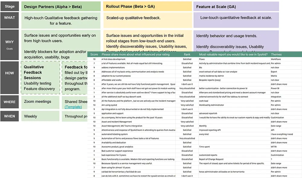
Customer Feedback Surveys

We analyzed ongoing surveys from SysAid users to identify common feedback trends:

Positive Feedbacks
  • Customization options are appreciated.
  • API integration for admin management is highly valued.
  • Effective closed ticket tracking.
Negative Feedbacks
  • Customization complexity is a major frustration.
  • Unresolved tickets cause user friction.
  • Asset management struggles and limitations.
User Usage Statistics

Analysis of user interactions with the Classic platform compared to other ITSM platforms identified the most frequently used features

Feedback process & Survey result
Most Frequently Used ITSM Features

Competitive Analysis

A thorough competitive analysis was conducted to benchmark SysAid’s ITSM system against leading competitors. This involved evaluating their strengths, weaknesses, and unique features. The insights gained from this analysis helped in identifying gaps and areas for improvement in our own platform.

Positives
  • Comprehensive Design: Offers a powerful, enterprise-level interface with deep customization.
  • AI Integration: AI-driven features make workflows more efficient and assist with incident management.
  • Customizable Dashboards: Users can create highly tailored dashboards for real-time data tracking.
Negatives
  • Overwhelming UI: The sheer number of features can make the UI complex and cluttered for new users.
  • Steep Learning Curve: Non-expert users require significant training to navigate the platform efficiently.
  • Slow Navigation: The complexity of the system can result in slower navigation, especially for less experienced users​
ServiceNow Freshservice NinjaOne
User Interface Design Comprehensive but complex for new users, enterprise-grade UI Clean, modern, simple for non-technical users Clean, minimal design, focuses on IT asset management
User Experience (Ease of Use) Powerful but with a steep learning curve for new users Intuitive, easy for IT and non-IT teams Extremely easy-to-use, with quick setup and navigation.
Customization Flexibility Highly customizable for enterprise needs, but can be overwhelming Good flexibility without complexity, suited for small to mid-sized businesses Moderate customization, best for IT and MSPs, but less feature-rich
Dashboard Design and Customization Fully customizable dashboards, but requires training Simple, effective, and customizable for quick overviews. Clean and functional, but less customizable than competitors.
Navigation and Information Architecture Comprehensive but requires training due to complexity Simple and straightforward navigation Easy and efficient navigation, designed for fast issue resolution.
Positives
  • Clean and Intuitive UI: Simple, modern design that’s easy for both IT and non-technical users to navigate.
  • Quick Workflow Setup: Drag-and-drop interface for workflows.
  • Easy Customization: User-friendly customization of dashboards and workflows.
Negatives
  • Limited Advanced Features: Less suitable for large enterprises with complex ITSM needs.
  • Shallow Customization Depth: Customization options are not as robust as more enterprise-focused platforms.
  • Basic Design for Large Teams: While simple, the design might not scale well for larger teams needing more functionality.
Positives
  • Simple and Efficient UI: Designed for quick navigation with a clean interface, especially for IT teams and MSPs.
  • Fast Setup: Minimal setup time with a low learning curve.
  • Streamlined Workflow: Focused on providing efficient IT management with simple workflows.
Negatives
  • Limited Customization: Fewer customization options compared to other ITSM platforms.
  • Narrow Focus: More focused on IT asset management, with fewer ITSM-specific features.
  • Basic UX: Lacks advanced features for larger or more complex ITSM environments​.

User Personas

Based on data from user interviews and surveys, I developed detailed user personas and journey maps, dividing them into three primary groups based on their interaction with SysAid’s ITSM platform

Existing Clients
Small Organizations (Tier 1-2)

Profile
Small helpdesk users with light use of ITSM features, working mainly in basic tasks.

Familiarity
Familiar with the ‘Classic’ platform, with minimal concerns about switching to ‘Spaces’.

Needs
Simplicity in workflows, faster transitions, and minimal disruption during daily tasks.

Pain Points
  • The outdated ‘Classic’ UI slows down everyday task completion.
  • Navigation in ‘Classic’ is confusing for new team members.
  • Concern about workflow disruptions during the migration process.
  • Fear of downtime reducing productivity during the migration.
Medium to Large Organizations (Tier 3-4)

Profile
Large enterprise users with extensive ITSM integration across multiple departments.

Familiarity
Highly dependent on the ‘Classic’ platform, facing major challenges moving to ‘Spaces’.

Needs
Advanced customization, deeper integration, and support for more complex IT workflows.

Pain Points
  • ‘Classic’ lacks modern features needed for large-scale operations.
  • Customizing ‘Classic’ is difficult and limits operational efficiency.
  • Complex migration due to deep integration with other systems.
  • Learning new workflows in ‘Spaces’ adds strain to daily tasks.
New Clients
Small Organizations (Tier 1-2)

Profile
Small businesses moving from simpler platforms, seeking ITSM solutions.

Needs
Fast onboarding, user-friendly design, and quick adoption with minimal effort.

Pain Points
  • Difficulty adapting to new workflows after simpler platforms.
  • Require strong support for non-technical team onboarding.
  • Expect a simple, intuitive interface that’s easy to navigate.
  • Concerns that setup complexity will delay initial adoption.
Medium to Large Organizations (Tier 3-4)

Profile
Large enterprises migrating from advanced platforms with high expectations.

Needs
Scalable features, robust functionality, and smooth integration with systems.

Pain Points
  • Expect customization to be superior to competitor platforms.
  • Worried about a steep learning curve during the transition.
  • Concern over integration issues with existing systems.
  • High expectations for ROI and platform stability post-launch.

Wireframe Overview

During the design phase, I created multiple wireframes to prototype key pages of the ITSM platform. These wireframes helped refine the user interface, ensuring simplicity and clarity in user workflows. By focusing on highly used pages such as the Queue Page and the Ticket Page, I was able to validate design decisions early through usability testing and stakeholder feedback, making adjustments to optimize efficiency.

Queue

Designed to allow users to manage and filter tickets with ease. It provides a clear and organized table structure where users can view key details such as ticket descriptions, assignees, and status indicators. The filtering system at the top of the page helps users quickly adjust views based on their needs, while the clean layout minimizes visual clutter, improving overall navigation speed and usability.

Ticket Page

Focuses on presenting detailed ticket information in an intuitive format. Each section is clearly labeled and allows users to easily access fields for ticket data, related items, and action items like attachments and journey tracking. By providing a well-structured layout, users can quickly assess ticket status and perform actions like reassignment or resolution with minimal effort.

User Testing

Prototypes of the new design were developed and subjected to multiple rounds of user testing. This iterative process involved gathering feedback from actual users, identifying usability issues, and making necessary adjustments. The goal was to refine the design to be as intuitive and user-friendly as possible.

Service Record Resolution
Related Items
Action Item (Workflow)

Implementation

The final phase involved close collaboration with the development team to implement the design. Regular feedback sessions and agile methodologies were used to address any issues promptly and iterate on the design as needed. Post-launch, continuous monitoring and user feedback were utilized to make further enhancements.

Final Screens

Design System

A comprehensive design system was developed to ensure consistency and efficiency. This included a set of guidelines for typography, color schemes, component libraries, and interaction patterns. The design system not only streamlined the development process but also ensured a cohesive user experience across the platform.

Excerpts From SysAid’s Design System

Queue

The Queue page serves as the nerve center of the entire platform, consolidating all open tickets along with their detailed data.

Design Strategy

I led the redesign of the Queue page, aligning it with modern design trends. By analyzing user behavior & researching similar software, I identified key functionalities & streamlined the layout for intuitive access, I ensured the design met user requirements and enhanced platform functionality.

Queue's Main Features

Inline Edit

The key advantage of this Queue over previous products and competitors is that every cell can be edited with a single click, saving the admin time and allowing for efficient multi-action updates.

Custom Column

A sidebar menu allows users to add custom columns to the queue table & rearrange their positions.

Graphic Chips

Using graphical elements to help users differentiate between various field types, making data reading quicker & more intuitive.

Queue Views

Created, saved & shared for recurring use according to Admin needs, tailored to specific situations & use cases

Ticket Page

The ticket page is structured into two main sections: The left side displays the ticket information fields, which are customizable through pre-made and custom templates. The right side features several key functions under different tabs

Design Strategy

I ensured that users can easily access and manage ticket information. Additionally, I prioritized the flexibility of the interface, allowing customization through pre-made and custom templates, and incorporated key functionalities into distinct tabs.

Ticket page's Tabs

Action Item

Automated processes and tasks that guide IT service management activities.

Journey

An actionable audit log that tracks all activities related to the ticket life cycle, enabling Admins to oversee and manage the resolution process.

Attachments

consolidates attachments in a gallery format and provides a quick view for each file type uploaded.

Releated Items

Serves as the control center for all related items, allowing users to add various types & view them in separate tables.

Template Designer

admins can create and edit ticket templates using an intuitive drag-and-drop system, organizing fields in a three-column layout and viewing properties like restrictions, hints, and mandatory status for each field.

Design Strategy

The design of the Template Designer focuses on simplicity and efficiency. The three-column layout facilitates a logical workflow, with drag-and-drop functionality to build and organize templates easily. This design approach ensures that users can quickly create and modify templates to suit their specific needs

Explore More of SysAid’s Product Designs